So, you’ve written out your resume. You have your bullet points and you know exactly what jobs to put on your resume into convincing employers you’re qualified and ready for an adult job. You’ve written your employment and education history along with the descriptions, now you take a step back. What is missing? Does it look like this will catch an employer’s eye or will it look like everyone else’s?
Never fear, College Magazine is here to help your resume stand out and make your employer’s say, “Wow, I want this person!”
The Type of Internship is Important

The style of your resume depends on the type of internship you’re seeking out. For example, a more formal internship in business or sciences requests a strict layout.
“You must separate your different categories with thick black lines, and never forget it,” said Anush Jain, a junior at Drake University.
Also, remember to avoid color and keep it strictly black and white.
If you’re not going for a formal internship in business or science, you have room to make your resume more colorful. Digital media and more creative internships call for a more personalized and eye-catching resume. You can use columns or rows instead of just a standard list. Be sure to still break your resume down into categories such as education, former experience and references, but you can add a pop of color of a mixture of fonts to make the categorization stand out more.
Basing your resume on your employer’s colors, fonts and style can really show them that you’re a good fit because it represents that you already know how to represent the company in your own personalized way. Whether it’s a formal internship or a more design-based internship, the most important rule is to keep your resume to one page.
Personalize it for Yourself AND Your Employer

Your resume should be personalized yet mirror the company you’re hoping to work for. Think about the colors of the company, the fonts used and try to incorporate those elements into your resume to show them you fit in at the company.
“One trick is when you’re thinking about your audience, think about the color scheme that is used by the employers to brand their company… What is something that looks like their branding? Then make your resume look like that, it’ll look like you fit in right away,” said Carlyn Crowe, the internship director at Drake University.
Don’t use this trick if you’re shooting for a more formal internship. It’s important to remember that formal employers have a strict layout.
Color and Font is Important, but Make it Readable

For a more formal internship, organize your information into a list, separated by thick black lines to make it obvious when a new subject comes up.
“Dates should be in italics, work on the side also in italics, company and job be bolded,” said Jain. These resumes are easier to create.
The thing to remember with these resumes is that you’re just trying to get the information down, the cover letter is when you sell yourself and help your employers get a better sense of you.
Crowe also stressed the importance of choosing appropriate fonts and colors. You’re more than encouraged to use special fonts and colors to continue to personalize your resume. Blue is more cool and collected, red is a power color and pink is soft and neutral. Sans Serif fonts, like Times New Roman, are universal and appropriate whilst still being readable.
Kaili Miller, a junior design major at Drake University suggests Aviner or Ditto font because of its chic and modern look. Regardless of color or font, your resume must be readable.
Keep in mind that some employers may print your resume or keep it on their monitor, and not all monitors are the same. Be sure to choose colors that won’t fade if printed in black and white and won’t be so bright they hurt the eyes on different computer monitors.
White Space is Your Best Friend
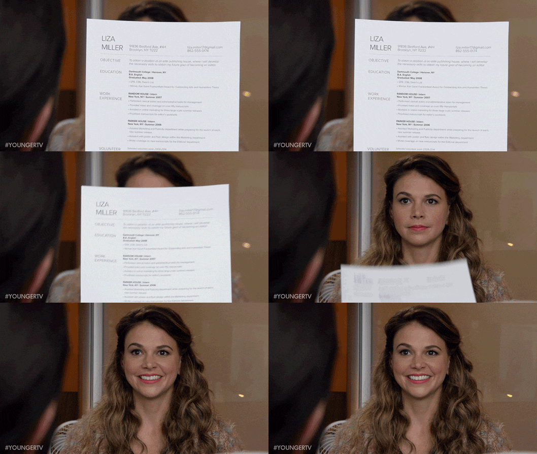
At the end of the day, regardless of type of internship, white space is your friend. White space is the space between design elements.
“If you use white space in a very strategic way it can be very efficient… I think it’s a good way of showing there is a lot of type but not too much type… If you can [balance white space], then you’ll be able to keep your reader’s eye and it’ll show that you can effectively use design to your advantage,” said Miller.
White space is important. Don’t try to cram all your information, strengths, jobs and skills you’ve learned into one page. Too much wording on one page makes the head hurt and can bore your reader. Use white space to offer a break and make your resume more striking by showing you can convey the important information into a small area whilst still looking visually appealing. This shows employers you can be stylish and efficient.
Should You Add a Photo?

The jury is still out on if you should include a photo on your resume.
“In a formal, business resume you should not [include a photo],” said Jain.
Crowe suggests it depends on the internship and employer and to feel out if it feels appropriate. Miller also suggests we are in 2020 and it is important for employers to visually connect a face to the work experience. It is up to you, that’s your resume. If you do choose to add a photo, use a photo editor like Photoshop to turn down the saturation so your face still looks clear in print or on a computer screen. You don’t want your photo bleeding together or looking blurry.


