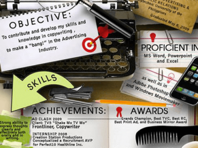
Crafting a resume surely seems like serious business. A good resume can make the difference between your employment and your unemployment. It’s a lot of responsibility for such a simple, unassuming sheet of paper, and so — striving for utmost perfection — people tend to follow one or two rigid formats. But if you’re in a field that values sticking out like a sore thumb (like, say, visual arts), your resume is a perfect opportunity to express your unique flavor of creativity. If you’re brave enough to take the risk, here are a few tips to help keep it classy.
DO add colors that reflect your personal tastes, but limit your palette to one or two soft shades. Too many patterns or bright hues and your resume will become an eyesore, and the hiring manager will have a bad taste in their mouth before they even start reading. Also, needless to say, avoid animal prints at all costs, especially cheetah.
DON’T force whoever’s hiring you to search for the information they want. Business Insider said that a busy hiring manager will only look at a resume for about six seconds before making a decision. If they’re not able to find your education and work experience within that time frame, your battle is as good as lost.
DO keep the clutter to a minimum. This goes along with the previous point: design flourishes might be flashy and eye-catching, but the core of your resume is the text you want your audience to read. If your Photoshop brushes and fancy fonts are too distracting, no one will have the patience to glean the information they need. Use the “K.I.S.S.” design mantra when putting together your resume—Keep It Simple, Stupid.
DON’T send the same exact resume to multiple hiring managers. Instead, tailor your resume to each company you apply for. Include keywords listed in the job’s ad listing and try incorporating elements of the company’s design patterns into your resume.
DO keep a plain-text backup resume just in case. Sometimes resumes submitted over the web are scanned by an electronic resume management system (or ERM), which are notorious for their inability to decipher artistic embellishments. Some companies won’t even accept resumes that aren’t printed black-and-white on 8.5 x 11” paper. For situations like these, you don’t have to fall back on those plain Microsoft Word formats. You can design your own plain-text resume, adding only minimal flourishes like varying fonts and page dividers — but be sure to print out a test copy, as the printed version sometimes looks far different than it does in Word.
DON’T be afraid to ask for help (or hire it!). There are tons of companies out there whose business revolves around designing resumes for their clients. Sites like Orange Resume and Loft offer an expansive selection of artsy templates. Even if you don’t want to pay to use the premium ones, their resume repository might help inspire you to design something similar.
If you’re still in college or a fresh graduate, don’t let your resume seem more ambitious than you are. Having a heavily designed page is only justifiable when you’ve got the expertise to back it up — otherwise you’re just hiding your lack of experience behind a flashy template. Only call attention to yourself if you really deserve the spotlight.

