Am I the only one that thinks the fun of buying books at a bookstore instead of online mostly comes down to the pretty covers? Getting to hold them in my own hands, admire the vibrant colors, the ancient aesthetic, the pastel feel. So many pretty covers, such little purse space! If I can’t buy them all, then I will happily talk about them here. Maybe they’ll inspire you to head to your local bookstore today.
If nothing else, I’ll get to blab about pretty books, so—silver lining.

1. The Ballad of Never After by Stephanie Garber
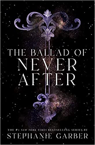
I’m focusing on the second book in the series because of what exists underneath the dust jacket of the hardcover. Fun fact, I read that book fully expecting it to end the series. When I got to the end and a whole new storyline started, I found out that it was only the second book in a trilogy. Yet, I will recommend it to the end. Why? Because it looks so pretty. With a beautiful black background, the purple arrow in the center immediately catching the eye. And let’s not forget the GLITTER! So. Much. Glitter.
“I love the contrast of the colours, and how they used the pink arrow as a reference to Evangeline’s hair and the archer and the fox story,” University of Science and Technology Houari Boumediene alumnus Katia Loucheni said.
As for the hardcover underneath, they don’t just give you a plain color. No. The Ballad of Never After presents engravings on the actual hardcover under the dustjacket. They try to make the book look like an ancient copy mentioned inside the actual book, and it looks so painfully cool. Just trust me and get the book.
2. Daughter of the Moon Goddess by Sue Lynn Tan
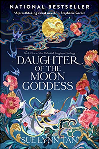
The simplest way to explain this cover: it looks like a professionally done acrylic painting on flowers, the moon and nature. And wow, does it do the job stunningly. The most striking part to me comes down to bits of gold in the cover. They just leap off the page and make you feel like you can stand right there alongside the main character. I don’t know what else to say about this book, but I do know that it features fantasy, a moon goddess and adventure. If that doesn’t sell the book, then at least just pick it up for the cover.
3. The Invisible Life of Addie LaRue by V.E. Schwab
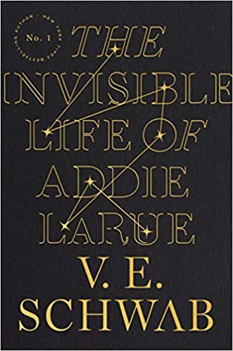
You know about this one, right? I can’t think of a book that people raved about more than The Invisible Life of Addie LaRue, and I can’t fault them for it. When I saw the constellations on this title, I fell in love too. I think the most captivating part falls to the way the stars connect throughout the title and Addie’s name, as if to really emphasize how integrated she is into the universe. Does that make sense? Like wind, no one thinks about her after she passes by.
“I love the black cover. It got my attention, especially with the constellations. I love that it was designed that way,” California Baptist University second year graduate student Danya Reyes said.
It seems simple at first sight, but it really doesn’t feel that way at all. It feels encompassing, like the story talks about destiny and magic and explores secrets of the universe. Which, in a way, it kind of does. The story considers choices, their consequences, what it means to really live and leave your mark on the world. Truly, it gives me chills.
4. Kingdom of the Feared by Kerri Maniscalco

Skulls, crowns and lots of flowers. Need I say more? Fine, I’ll say more. As the third book in the series, this one carries a particularly captivating cover that caught my attention immediately when I checked out the fantasy shelf at Barnes & Noble. I think the really striking part falls to the three-dimensionality of the cover. Everything looks very real, very much there and it sticks out demanding your attention. Which makes sense, given the story. And no, I won’t spoil it for you.
5. A River Enchanted by Rebecca Ross

Remember when I talked earlier about a cover that looks like a creative acrylic painting? The same applies here. There exists a few different versions of this cover, but the one that absolutely blows my mind holds a stream in the middle with beautifully painted waters. Flowers hover on the edges and everything about the cover feels vibrant, alive and fun. With Celtic themes that match the cover’s colorful aesthetic, this book promises a good time.
6. Babel by R.F. Kuang

Does loving this book’s cover for the architecture make me a nerd? Oh well. This book features a good amount of dark academia, and you can tell when you look the cover art. Drawn in black, white and grays, it shows a crowded London city back in 1828. It promises ominous storylines, adventure, mystery and intelligent characters. Again, given the story, it makes sense. Nothing I love better than when the cover art reveals enough about the story to pique my curiosity about the plot.
7. The Witch’s Heart by Genevieve Gornichec
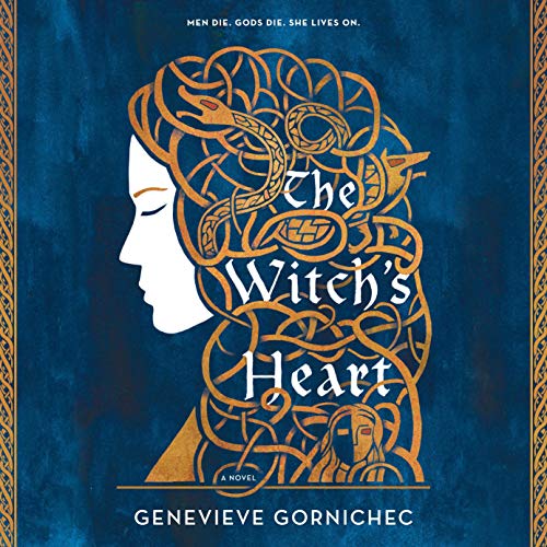
Okay, I will admit, I really don’t like it when books display people on the cover. However, I think if they consist of an outline of a face and a gold snake or dragon for hair, then it doesn’t count as the same thing. In other words, The Witch’s Heart’s cover feels otherworldly. Very simple, but intricate. The cover creates a million impressions upon first glance. I first thought when I saw it that it focuses on Medusa or something, whose hair consists of snakes that paralyze you, but no. The book is actually on Norse mythology instead. Either way, pretty cover means it catches your attention, one way or another.
8. The Stardust Thief by Chelsea Abdullah
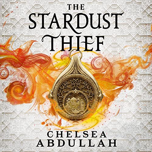
This cover? So cool. I genuinely don’t know what else to say. I can only think that the cover reminds me of Aladdin, which makes sense as it borrows from other Arab-inspired stories. With a genie’s lamp on the compass in the center, and a burst off flames around the golden device, the cover already depicts adventure, conflict and a take on ancient Middle-Eastern tales.
“The Stardust Thief is published by Orbit, and Orbit has been a leader in the cover art game as far as I am concerned. I don’t think I’ve ever encountered a cover from Orbit I didn’t like. What makes TST stand out to me is the use of color and texture. I see a lot of fantasy books in darker shades, but TST is bright orange and purple and cream. The background isn’t featureless either; there’s a beautiful geometric pattern that runs all the way around from front to back cover. Finally, they included some shiny gold sparkles. Put sparkles on a book cover and I’m sold. TST is one of the prettiest book covers I’ve ever owned. And the sequel is looking to be even better!” San José State University alumnus Jenna Glover said.
The engravings on the back of the book give it whole other dimension. It feels like so much is going on behind the compass, and I think the cover artist intended that. At first glance it looks like a simple cover with nothing but a single flaming object in the center. But look deeper, and you’ll find patterns and symbols in the compass, different hues in the flames themselves, drawings in the white background. Combined, it feels clever, mysterious, and just very pretty.
9. The Final Strife by Saara El-Arifi

I know I just said I don’t like people on book covers, but I swear, this cover looks like something out of a museum. It looks so pretty, the colors so vibrant, the pain in the character’s face so apparent. The artist clearly worked hard on placing so much detail in even the main character’s braids and the shine of her earring. The background not just a deep blue, but composed of blue flowers. The character’s eyes not just brown, but a glimmering brown. I just can’t. I went to a museum once in LA, and I don’t remember the name, but the framed paintings looked exactly like this cover. It certainly caught my attention—the most you can ask of any cover.
10. The Golden Enclaves by Naomi Novik
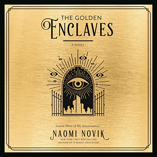
I can’t help it; my heart sings in dark academia. This cover fits that mold to perfection. Did you know that you can create your own old-timey parchment paper by taking a white paper and soaking it in dark tea for a bit? It gives it that ancient library feel. That feel summarizes what this cover looks like. With a simple beige-brown paper, delicately drawn black gates and the outline of a school of magic with hovering eyes, how can you resist? I should specify this book counts as the third in a series as well, but it certainly makes you want to look up the first two, doesn’t it?
Nothing gets me excited about a book like a pretty cover. I think when the artist can create a mystical-enough feel on the front page, that sparks the reader’s interest. We want to pretend that only the contents sell a book, and maybe they should, but they don’t. We all want pretty covers on our shelves. But then if we didn’t, so many artists would sit at home with nothing to create. So I guess our love of aesthetic counts as a kindness. Nay, a duty. Yeah, sure. Let’s go with that.


